Prima Ballerina and Broadway Baby

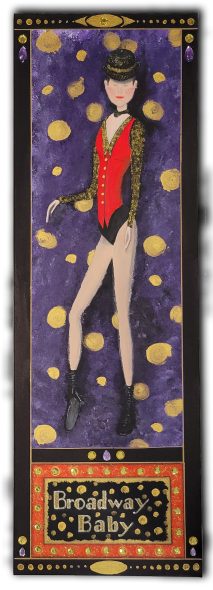
As most of you know, I am getting ready to show my art at a local amateur theatre in the fall. This is a pair of dancers that will be in the show. They are both mainly acrylic paints with a few added things like a metallic marker, clay and rhinestones to add a little texture to each piece. 

The first piece is called Broadway Baby. Rhinestones are used to portray the lights of the Broadway sign as well as near the top, a purple teardrop and a round yellow stone. The purple and yellow are also used on the bottom, both sides and in the middle. The rhinestones are covered with a super gloss top coat to give them a high-gloss shine. Also, a gold metallic marker is used for the border and gold, and yellow sparkle glue was used for the hat, the blouse and the sign. 

The second piece is called Prima Ballerina. I have added a few clay pieces made from clay moulds, and the silver lines are made using a silver metallic marker. I used a stencil for the top and bottom decorations with silver acrylic paint.

I hope you enjoy and for those who are local, I hope to see you at Centre Stage Theatre in Kentville in October. Enjoy the play and the viewing of my art. 

Mother & Daughter

I have been working on a few art pieces for an exhibition at an amateur theatre this fall. I am using a multitude of mediums, including acrylic and watercolour paint, oil pastels, polymer & air dry clays, different-sized canvases, and watercolour paper. A few of the pieces involve using different types of clay and acrylic paint on canvas, all surrounded by a wood three-dimensional frame.

For this particular project, I used only two colours, blue and white. It is called Mother and Daughter. They are seated having their special tea time.

I used polymer clay for the figures, an 8″ x 8″ canvas, acrylic paint, 2 3/4″ x 3/4″ wood for the frame and 1 1/4″ wide moulding for the front to finish it off.

Famlaer – The real faeryland, another sneak-peak.

Famlaer is a book about faeries. It’s mainly introducing the community and how they are created. It is more description than story at this point. My next book will be more story-like but still lots of introduction and descriptions of faeries not mentioned in the first book.   

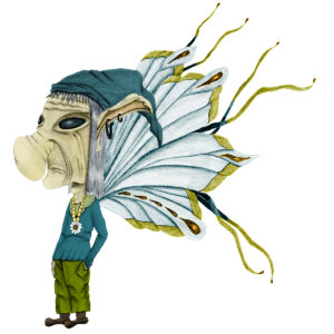
In the meantime, I’d like you to meet Naldoow, the forest keeper. He is one of my favourite drawings. I thought it would be fun to make a faery look like an old hippy rocker. He is just one of many fun and unusual characters in Famlaer – The real faeryland.

This little fellow is the oldest looking of all the faeries. They are always male, they live to be 98 years old, and there are at least five around at all times. They live in the trees, making them the highest flyers of the whole of Faeryland. They fly to the tops of the tallest trees, acting a little like a scout watching for problems. The forest keeper has an overly humungous head but sports a small body, hands and feet. Quite out of proportion. Although he looks old, he’s actually one of the most energetic faeries. They always have a scowl on their face but have a wonderful sense of humour and for the most part, are quite happy. He resembles what we call a hippy from the sixties.


Famlaer paperback is available on Amazon.com for $9.95 US, $13.20 CA as well as UK, DE, FR, ES, IT AND JP. If you would rather read a digital copy it’s available for $4.98 US on all the same as above plus NL, CA, MX, AU AND IN. (the digital version is not available in mobi or epub, but can be read on your phone, tablet or computer using free readers that can be downloaded through Amazon or your mobile market)

Happy reading everyone.

To friends, family and followers, please share this link or search my book on Amazon and of course buying and giving it a favourable review would help tremendously. I would like to thank you all in advance for your support. It is most appreciated.

A Fairy Book – My Process Using Pencils & Computer

Once again it has been eons between my posts. I thought I’d take you through a process I am doing in making drawings for my fairy book. This is not a lesson, it’s just the way I am producing these drawings.

I’m using mixed media involving pencil drawing and computer colouring. I want to apologize for the low quality photos; they were taken with my tablet.

I start with a sketch, of which I don’t have to show, but none the less that’s where it always starts. This drawing is of the Fairy Keeper and his pet. I haven’t come up with names for the keeper or his pet yet but the pet is an RTC (really tiny cat). Of course you’ll notice that the man is smaller than the cat which means he is also quite tiny.

The entire drawing is drawn with an HB graphite pencil. Once I’m satisfied with the drawing, sometimes that’s 2 or 3 or 4 drawings later, I begin the process of shading it. Each type of shading requires a different shade of pencil. As you probably already know there are many shades or hardness of pencils such as H (1, 2, 3, 4, etc), B (1, 2, 3, 4, etc.) and F. You also have HB which I use to make most of my drawings. I use the H pencils for my lighter shadings and the B’s for the darker shadings. As I’m shading with the pencils I’m also using a stump or tortillon to blend it. There’s a good explanation of the difference between these two smudging tools at this web site—Pencil Drawing – Blending and Shading – Learn to blend and shade your drawings with JD Hillberry. I must admit, after watching the video I realized I wasn’t using these tools in an entirely correct way, but I did get the desired effects I was looking for. There’s also another web site I found to be quite informative, Rapid Fire Art 

Fairy Book artwork from begining

Once I’m finished the shading, I scan the drawing at 600 dpi grey-scale. I find this setting works best for my purposes. Next, I open it in Photoshop and the first thing I do is select Image, mode then RGB so I can add the colour. Then I tweak the drawing a bit using the levels adjustment to bring out a little more detail in the lines. This can also be done during the scanning process, but I find it works better in Photoshop. Now the process of colouring begins by adding a new layer and naming it. For example, I will make a layer for face or skin tone. Next I go to my foreground colour picker to choose a suitable colour for my skin tone. For the Fairy Keeper I chose a medium pink-orange tone. Using a soft mechanical pencil brush, I begin adding colour to the face. While adding the colour I change the layer blending to “Colour Burn”. The layer blending is different for other parts of the drawing depending on the effect I’m looking for. For instance the clothes are done using a “Linear Burn” instead of the “Colour Burn” to give the colour a little more intensity. I also use “Overlay” on occasion. I will do each part of the face on a different layer then make a new group layer from selected layers and call it Fairy Keepers face. That way if I decide to change the colour of his eyes I can just go to the face group, find the eyes layer and change the colour. It’s also helpful using groups to keep the layers list from getting too long. From here I just do each part of the drawing adding layer after layer until I’m finished.  I used some special brushes to make the grasses and bubbles. I also added a couple of my individual fairies to this drawing of which I went through the same process to colour. One on the roof and the other behind a blade of grass. Now I’m finished colouring the drawing.

For the last thing I open a template that I’m using for the frame around each of the drawings. Next I will go back to my finished drawing and flatten the layers and then drag it over to the template, size it to fit the square and change the outside colour of the square to match with my drawing. That’s it I’m done. I make a glossy print and put it on the wall with the rest of the fairy work I have done so far then go to work on the next drawing.

As I said at the beginning, this is not a lesson. I don’t always do things by the book where art is concerned, sometimes it works and sometimes it doesn’t, but I learn a lot with each endeavor and I really enjoy what I do.

Don’t forget to check out Islandhosting if you’re looking for a good web host. I’ve been with them now for over 15 years and they’re the best. Islandhosting techs are always helpful when you’re having problems especially with WordPress sites. Click the link below to check them out.

ihlogo-f56e00--300-

Artist of the Month

I discovered a new artist when a Facebook friend posted a piece of her work. I fell in love and just had to feature Jessilyn Park on my blog this month.

Jessilyn currently resides in Orlando, Florida and until two years ago she had never done any painting, artistically speaking anyway. When Jessilyn picked up a paint brush for the first time she discovered a great creative talent. She paints with bright, beautiful colours using broad brush strokes and her works are in great demand. You be the judge. Here are just a few samples of her work. If you’d like to read more about Jessilyn or see more paintings visit Jessilyn Park Art Studio Facebook page or the official web site Jessilyn Park Art Studio.
Click the photos for larger view.