Prima Ballerina and Broadway Baby

As most of you know, I am getting ready to show my art at a local amateur theatre in the fall. This is a pair of dancers that will be in the show. They are both mainly acrylic paints with a few added things like a metallic marker, clay and rhinestones to add a little texture to each piece. 

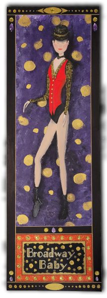
The first piece is called Broadway Baby. Rhinestones are used to portray the lights of the Broadway sign as well as near the top, a purple teardrop and a round yellow stone. The purple and yellow are also used on the bottom, both sides and in the middle. The rhinestones are covered with a super gloss top coat to give them a high-gloss shine. Also, a gold metallic marker is used for the border and gold, and yellow sparkle glue was used for the hat, the blouse and the sign. 

The second piece is called Prima Ballerina. I have added a few clay pieces made from clay moulds, and the silver lines are made using a silver metallic marker. I used a stencil for the top and bottom decorations with silver acrylic paint.

I hope you enjoy and for those who are local, I hope to see you at Centre Stage Theatre in Kentville in October. Enjoy the play and the viewing of my art. 

Oil Pastels

For this month, I decided to post some oil pastels that were originally created for a cafe in Victoria, BC. They were copied and used for signage, stationary and the logo. When I discovered them once again, I thought they would be ideal for an upcoming showing of my art at Centre Stage in New Minas, NS, in October of this year. I am very excited about this opportunity.


I used an artist’s wooden panels, 12″ x 12″ for the larger pieces and 8″ x 8″ for the smaller pieces for the frame. Each panel has a 3mm quality poplar wood board and a solid pine wood frame. I used acrylic paint on the background to match the oil pastels and moulding on the four larger pieces. Select each picture to enlarge it. 

See you next month.

Fairy Book in Progress

You’ll remember that I had several different methods that I was looking at for the art work to be used in my new fairy book; well I have finally decided how I want to proceed. I started with my usual pencil drawing, but instead of re-drawing it on to a canvas or water-colour paper I scanned it into the computer and started adding colour using Photoshop. For me it showed the best results for what I imagined this book to look like.

Here are samples of how I did this and what a two page spread will look like.The first photo is of the drawing without anything done to it. In the second one I’ve used levels in Photoshop to bring out the contrast a bit. The colour is added to the next one and the last is with the border and background colours as well as the description page with the lower flowers added for the text to fall between and the fairy wings on either side of the heading.

There is still a ton of work to be done on the project and I will probably make changes to backgrounds and maybe even colours but this is the general layout. Also I just want to mention that the words on the page are not necessarily how it will be in the final. I just thought it up while I was putting the page together. My process will be to draw all of the characters and scenes first then add the story to each illustration.

Let me know what you think. I’d love to know.

Greeting Cards

I love making greeting cards. I’ve been making them for a very long time now. My favourites to make are Birthday cards because you can make them a little more personal than Christmas, Easter or other seasonal cards.

I want to share with you the last card I made because it is one of my faves to date. I wish I had documented the whole process, but I didn’t, so I’ll just describe to you how I made it. I started with a rough sketch, then a proper drawing. Next, I scanned it into the computer, and the drawing was tweaked and manipulated a little more in Photoshop. I painted on the colour next using the Photoshop water-colour brush, and when I was satisfied with what I had done, it was added to Indesign to make the final layout for the inside and outside of the card. I proceeded to print out the card once, then just the front a second time. I cut and scored the card to the size I wanted. The second printout was used to cut out certain portions to be taped to the front using double-sided tape at different thicknesses. The paper I used was a watercolour paper for digital printing.  Here is the final result.